Eating Matters
-
Eating Matters was a podcast on Heritage Radio Network from 2014 to 2021.
“Food has emerged as a critical policy area—and it raises big questions about health, labor, sustainability, and our collective future. Join host Jenna Liut for conversations with food policy experts and leaders about the issues that shape our everyday experiences of buying, cooking, and eating food.”
-
Brand Identity Graphic Design
I first worked on the branding for Eating Matters in 2016. Time passed, life went on. But, in recent years, I’ve become more interested in the subject matter featured on the podcast—particularly the conversation around food, sustainability, and climate—and decided to revisit the project for fun. This was an opportunity to dive into the rich content archives of Eating Matters, refresh some old creative work of my own, and dive deeper into the exploration of the brand visuals.
-
Jenna Liut Host
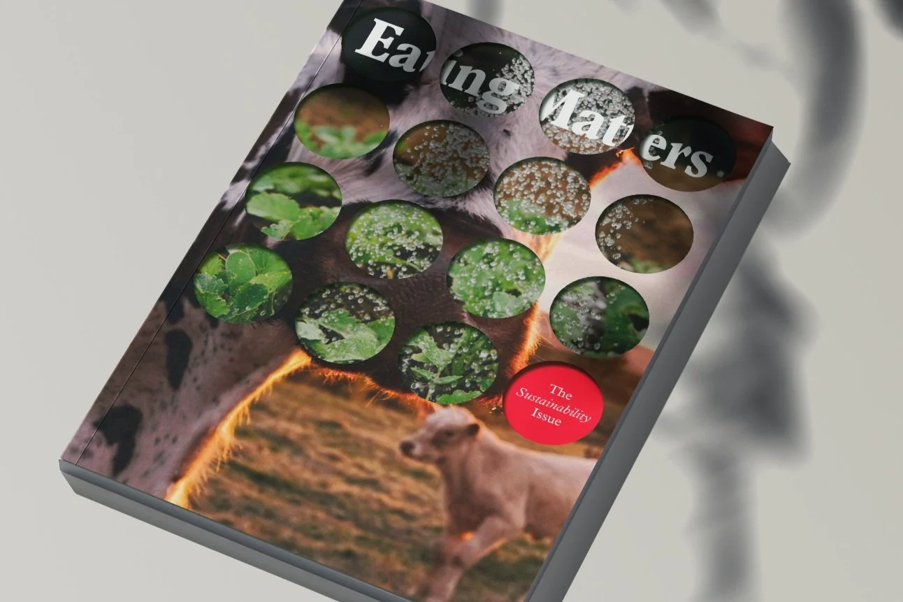
EATING MATTERS 1.0The original Eating Matters identity began as an exploration of familiar food iconography viewed through a more abstract lens. At the time, the food space was saturated with literal visual cues (forks and knives), so I wanted to create a system that felt more contemporary, enduring, and conceptually driven.
The original mark distilled the fork and knife into their most minimal forms: the prongs of a fork and the angled edge of a knife. By reducing these elements into simple geometric shapes, the identity retained a subtle connection to its culinary origins while avoiding overly explicit symbolism. The result was a modern, flexible icon that felt recognizable without relying on convention.
The supporting graphic system was constructed entirely from circles and modular forms, drawing inspiration from two interconnected ideas: biodiversity and agricultural crop rotation. Both concepts reflect systems of balance, regeneration, and interdependence, themes that aligned closely with the mission of Eating Matters. The repeating circular forms created patterns that felt organic yet structured, reinforcing the idea that healthy food systems are built through diversity and continuous renewal.
EXPANDING THE BRANDWhen revisiting the project this year, much of the original conceptual foundation still felt relevant. Rather than reinventing the identity entirely, the goal became evolving it into a more expansive and adaptable system.
For the refresh, I retired the standalone crossed fork-and-knife icon in favor of a broader graphic language derived from the original forms. By transforming the earlier iconography into repeatable patterns and compositions, the identity became more dynamic, scalable, and expressive across applications.
The wordmark was also refined using a condensed variation of Plantin, preserving the warmth and editorial quality of the original typography while introducing a sharper, more contemporary presence. The balance between retro character and modern restraint gives the brand a sense of familiarity without feeling outdated.
Color updates were intentionally subtle. The core palette remained consistent to preserve brand recognition, while the red was intensified slightly to bring greater vibrancy and energy to the system.
Finally, the refreshed identity introduced layered and masked imagery treatments as a defining visual characteristic. Overlapping compositions create a sense of abundance, movement, and interconnectedness, reinforcing the brand’s focus on food systems, ecology, and the relationships between people, agriculture, and environment.


Evolved and expanded branding from 2025